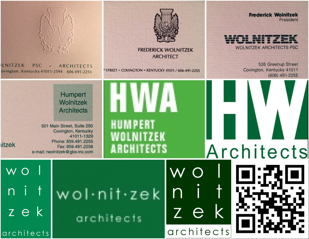
Architekwiki
  • WIKI
  • Start Here
  • Resources
    • Arch Fin Model
    • MyCorbu
    • Trello-PM
    • FeeCalqs
    • OFFPLAN
    • Reading List
    • Free Resources
    • All Resources
  • Other
    • Details
    • About
    • Sign Up
    • Terms of Use
  • MyCorbu APP
  • WIKI
  • Start Here
  • Resources
    • Arch Fin Model
    • MyCorbu
    • Trello-PM
    • FeeCalqs
    • OFFPLAN
    • Reading List
    • Free Resources
    • All Resources
  • Other
    • Details
    • About
    • Sign Up
    • Terms of Use
  • MyCorbu APP

Architekwiki

A Resource For Architects
Subscribe

Why Your Logo Should Be Square

1/11/2020

0 Comments

 
Logos

Square saves a lot of aggravation


During its 30 year existence my firm had quite a few logos. Many were BCE (Back in Caveman Era) and I had to photograph my business card collection to show you those. As you can see many of the versions were driven by a change in the name of the firm. These changes were mostly perfunctory. BCE a logo didn't have the visibility that it does now. Most people didn't see it until you handed them a business card, or sent them something in the mail. Email was ACE (After Caveman Era) so you didn't send out much promotional mail after a while because you eventually realized the time and cost that you were expending was delivering zero results. It turns out that people don't hire an architect because they get a piece of mail.

So when BCE ended on April Fool's Day in 1996, we got busy. Architects like the golden section, so we didn't have to think about shape. My favorite color is green so that was simple. All those names fit better on a vertical rectangle - WOW, that was easy!

Once ACE got rolling, websites added a new wrinkle or two. Nothing that was unmanageable. Social Media on the other hand ...

It became obvious pretty quick that Social Media did not like vertical - at all. Tumblr, nope. LinkedIn, nope. Twitter, nope. Facebook, nope. Google+, nope. Even non-Social Media sites like Basecamp  are not very permissive about shape when you personalize. In fact square is the clear winner / preference. Social Media definitely is fond of anything square or round - or square. Maybe that is because the majority of the big boys use a square or something very square-like. This graphic demonstrates that point; and, as a bonus, gives you a lesson in color selection for your new logo project. 
Logo chart
Graphic credit: Thelogocompany


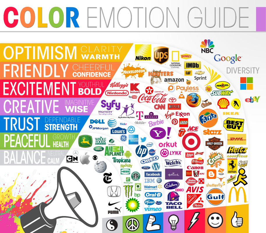
Even a favicon, that little doohickey to the left of the URL is a square. 16 pixels by 16 pixels is the specification. We never did catch on. There was always a new place cropping up to add our logo. We should have stopped experimenting when we got to the first one in the second row up above.

Another point worth making is that nobody cares about your logo so your time can safely be spent elsewhere. You won’t win more work (or lose work) because of your logo. Just look at the logos of the clients you aspire to work for; then create a logo that ‘fits in’ with those, but does not imitate them. Only change your logo when forced, and then only the minimum. You have better things to do with your time and resources.

You might have an ironclad reason for going off-formula; but, barring that, go with a square logo and save yourself a lot of aggravation.
Rick
0 Comments

Your comment will be posted after it is approved.


Leave a Reply.

    Resources

    Start Here

    Picture

    Picture

    MyCorbu

    Trello-PM

    FeeCalqs

    Picture

    Terms of Use
    Your use of Architekwiki is implicit agreement with the 
    ​
    Terms of Use.

    RSS Feed


    Categories

    All
    Business Development
    Communications
    Concepts
    Design
    Detail
    Estimating
    Finances
    Legal Issues
    Management
    Miscellaneous
    Money
    MyCorbu
    People
    Planning
    Process
    Projects
    Records
    Services
    Specifications
    Standards
    Time
    Tools


    Archives

    January 2021
    December 2020
    November 2020
    October 2020
    September 2020
    August 2020
    June 2020
    April 2020
    March 2020
    February 2020
    January 2020
    December 2019
    November 2019
    October 2019
    September 2019
    August 2019
    July 2019
    June 2019
    May 2019
    April 2019
    March 2019
    February 2019
    January 2019
    December 2018
    November 2018
    October 2018
    September 2018
    August 2018
    July 2018
    June 2018
    May 2018
    April 2018
    March 2018
    February 2018
    January 2018
    December 2017
    November 2017
    October 2017
    September 2017
    August 2017
    July 2017
    June 2017
    May 2017
    April 2017
    March 2017
    February 2017
    January 2017
    December 2016
    November 2016
    October 2016
    September 2016
    August 2016
    July 2016
    June 2016
    May 2016
    April 2016
    March 2016
    February 2016
    January 2016
    December 2015
    November 2015
    October 2015
    September 2015
    August 2015
    July 2015
    June 2015
    May 2015
    April 2015
    March 2015
    February 2015
    January 2015
    December 2014
    November 2014
    October 2014
    September 2014
    August 2014
    July 2014
    June 2014
    May 2014
    April 2014
    March 2014
    February 2014
    January 2014
    December 2013
    November 2013
    October 2013
    September 2013
    August 2013
    July 2013
    June 2013
    May 2013
    April 2013
    March 2013
    February 2013
    January 2013
    December 2012
    November 2012
    October 2012

    Resources
VISIT ARCHITEKWIKI'S RESOURCES
Picture
Architekwiki | Architect's Resource | Greater Cincinnati | (859) 444-4560
© 2012-2020   Architekwiki​