
Website Must-Haves
Show the work first. Everything else supports it.
Winning Criteria for Architectural Websites
Most architecture websites ask too much of visitors and give too little back. A prospect is not there to admire your branding exercise; they are there to decide whether you belong on the short list. Your site should answer that question fast, with work, people, location, and proof.
You have minutes, not hours, to make the case.
What prospects want to know
Visitors are silently asking the same four questions: what have you done, does it resemble what I want, who are you, and where are you located. A good architecture site answers those questions before the visitor has to hunt for them. That is the real test of the homepage.
If the visitor has to search for the basics, the site is already failing.
Show the work
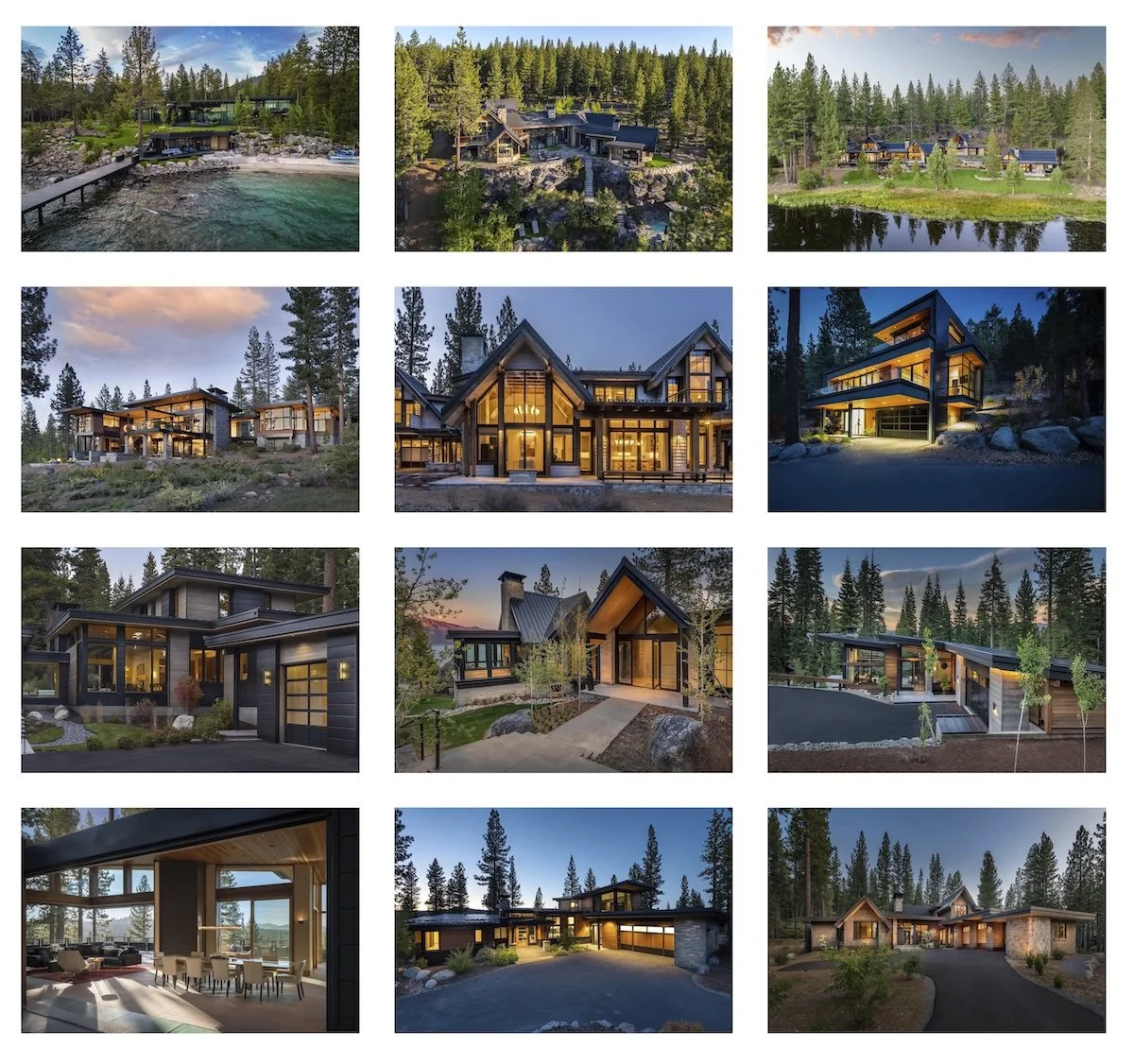
A project gallery should feel like a curated sequence, not a photo dump.
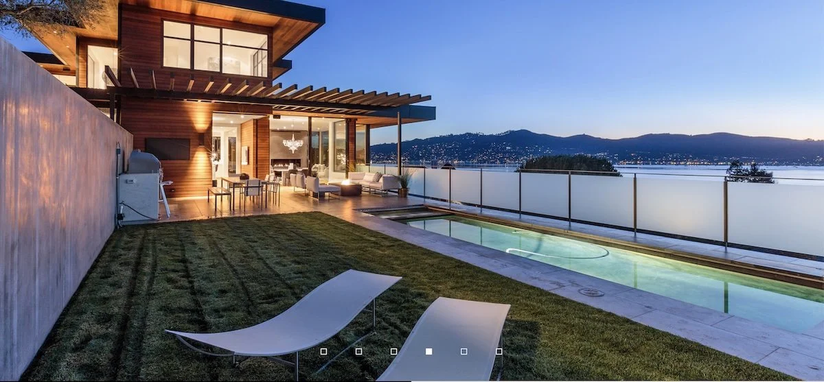
Lead with completed projects, not slogans. High-quality project imagery is still the fastest way to establish relevance and credibility, and simple project galleries are easier to scan than click-heavy layouts. Keep the focus on the buildings, not the interface.
This is where most firms either help themselves or waste the visitor’s time. A good project page should make it easy to see the work, understand the context, and move on to the next relevant example. One strong exterior image can do a lot of heavy lifting, especially if it opens into a fuller project page with supporting views. Better still is a key image with thumbnails or a small gallery that expands cleanly.
Keep navigation simple
Navigation should be obvious enough that nobody thinks about it. Clear labels like Projects, About, Contact, and maybe Process are better than clever or ambiguous menu names. If people get lost, your site is too clever for its own good.
Good navigation is quiet, predictable, and boring in the best possible way. Visitors should always know where they are and how to get back. If you have too many pages, too many labels, or too many hidden layers, you are creating friction that should not exist.
Show what helps them
If you have a useful specialty, tool, worksheet, or process that benefits the client, show it. Not because it makes you look smart, but because it makes you useful. A budgeting worksheet, a planning aid, or a defined process can be more persuasive than a dozen adjectives.
This is the part of the website that often gets overlooked. People do not just want to know that you can design; they want to know what makes the process easier, clearer, or safer for them. If you have a budgeting tool, a decision-making framework, or a specialty that saves time and reduces risk, say so plainly.
Tell them who you are
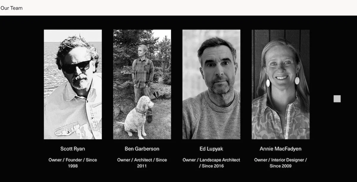
Real people build trust faster than polished language does.
The About page should be straightforward and real. Include the firm name, address, phone, email, staff photos, and brief bios of key people so visitors can see that actual humans stand behind the work. Trust rises when the firm feels visible and tangible.
Do not hide behind a vague firm statement and call it a day. People want to know who they are dealing with, especially if they are about to trust you with a serious project. A good About page makes the firm feel accessible without becoming chatty or overdone.
Control the impression
Color, typography, organization, and photography are not decoration; they are the message. A site should look like the kind of firm you aspire to be, but it should not pretend to be something it is not. If the visual tone is sloppy, the firm feels sloppy; if it is disciplined, the firm feels disciplined.
This is where the website becomes more than a container for information. Every design choice is making an argument about the firm’s standards. The goal is not to be flashy. The goal is to look intentional, credible, and aligned with the work.
Keep it current
A stale site looks neglected. Update it monthly if possible, even if the change is small, because regular updates signal that the firm is active and attentive. Ideally, the site should be easy enough to maintain in-house on short notice.
You do not need to reinvent the site every month. You just need to prove it is alive. A new project, a revised gallery, a brief blog update, or a fresh office photo is enough to show that the website is being cared for.
Don’t do this
Do not bury the visitor in a long list of services. Do not hide behind a philosophy statement. Do not turn the site into a wall of text. And do not get clever in ways that make the visitor work too hard.
These mistakes are common because they feel safe to the people making the website. They are not safe for the visitor. A confusing or overwritten site weakens trust and makes a firm look less certain than it may actually be.
Clever is not the same thing as effective.
Optional extras
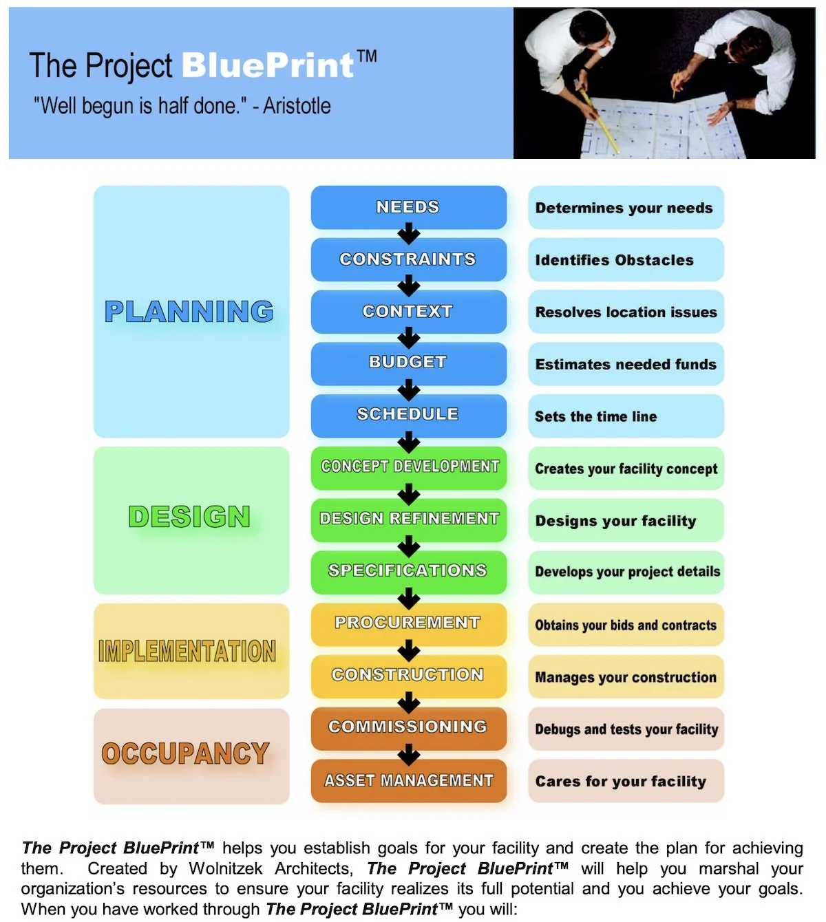
Visitor-focused tool
A few extras can help if they are honest and useful: office photos, images of tools in use, an evergreen blog, a clean logo, and SEO if you have a niche worth targeting. None of these should distract from the main job, which is to show work clearly and make contact easy.
Optional does not mean ornamental. These elements should support the story, not compete with the portfolio. If they add clarity, confidence, or usefulness, they belong. If they are just decoration, they are noise.
Closing note
A good architecture website does not try to say everything. It gives people enough evidence to decide that your firm is worth a conversation. The best sites are clear, current, visual, and direct.
Make the site useful, not clever.