The 2 Main Things About Project Signs
How tall does a sign need to be to be readable from a mile away?
I needed to know that because a regional airline we were designing a hangar for wanted a sign readable from the terminal across the airfield. Luckily hangars are big. We needed a spot that would accommodate a 25' long x 12' high 6-letter logo - 'Comair'.
Font Size vs Distance
I had been vaguely aware of the relationship between font size and distance. I knew from past experience that 10" letters worked well on schools, but that was about it. I think I found a rule of thumb in Graphic Standards; and, once we had a graphic, we verified the suitability with the sign manufacturer.
Signage Rules Of Thumb
The two critical issues in designing a sign are font size and contrast. Font size is pretty straight-forward, and easy to grasp. Apparently 'Contrast' is a hard lesson to learn. I am always amazed that signs get installed on commercial buildings where someone must have thought that matching the background was the way to go. And, there was probably a professional sign company involved, too! This resource below will steer you away from size and contrast problems. Size and Visibility Resource
ALL CAPS vs Initial Caps & Other Rules of Thumb
Besides font size and contrast there are several more rules of thumb that will keep your sign on track. Things like Initial Caps being easier to read. Let me give you some links that will give you all the nitty-gritty.
Creating Your Standard Project Sign
Besides saving time on each project, creating a standard project sign gives you a chance to establish and promote your brand. A lot of people will see the project sign. The appearance of the sign will get connected to you in their minds; and the project being built will likewise speak volumes about you. This is worth taking some time with.
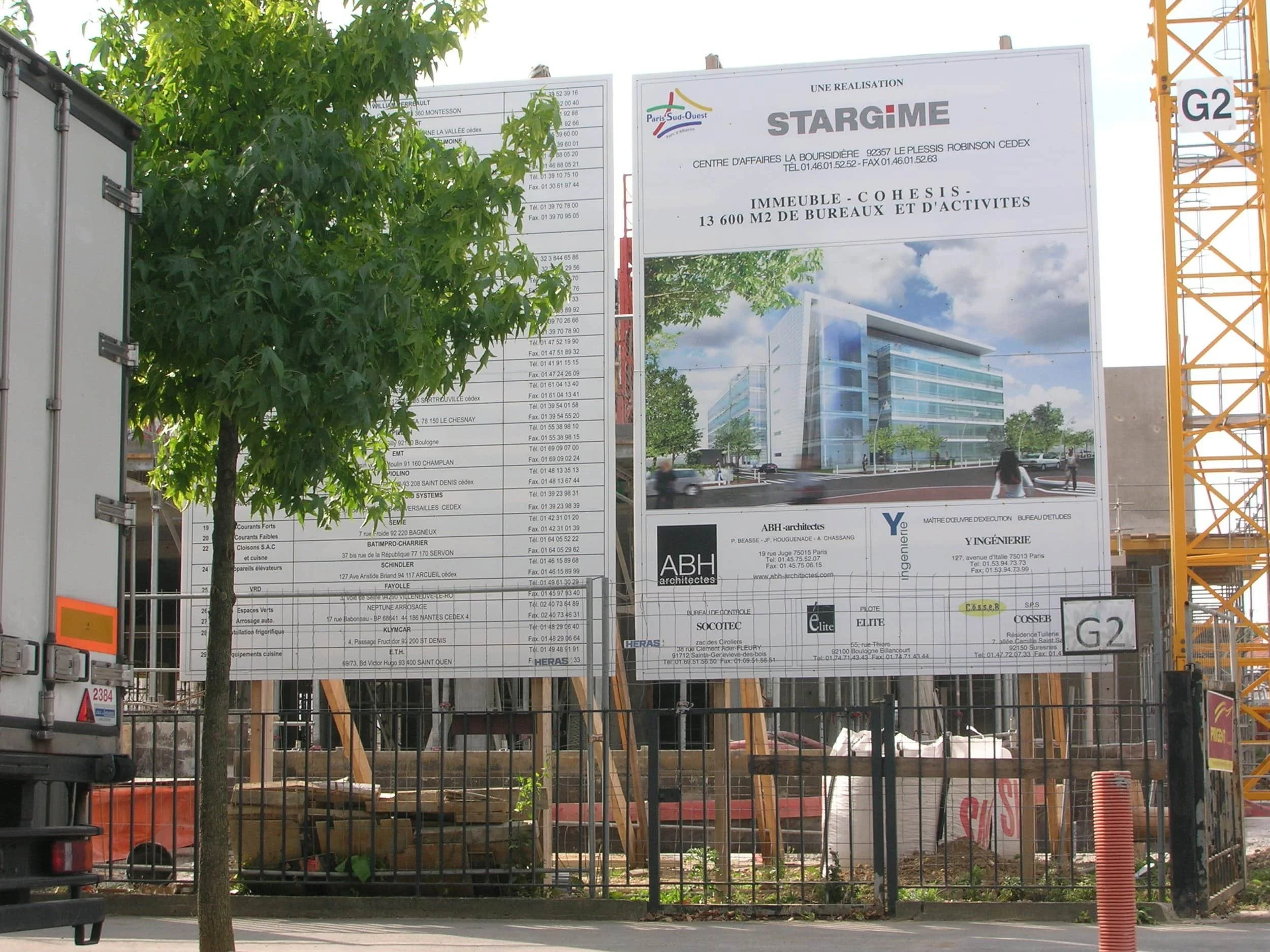
Always make your sign a minimum length of 8'. That will seem enormous; but, when you see it on the site, that thought will vanish. The standard layout for a project sign is three bands of information:
The top band contains the project name and Owner's name - sometimes a rendering as well.
The middle band contains the design team with the architect most prominent and the consultants smaller (if shown at all).
The bottom band contains the construction company(ies).
Most of the time the Owner pays for the sign by including it in the project. Sometimes the Owner has a standard project sign that he wants you to implement. Very occasionally, the Owner doesn't want a sign. If that is the case, ask if you can put up a sign and get the rules clarified on what is allowable, since the contractor and his subs will want signs, too. We always recommended that one spot be set aside for a combined sign and limited to 8'x8' or 8'x12'. In this case we furnished our own sign which was 8'x2'. We have never had a contractor balk at installing it for us.
Getting Your Site Sign Made
Normally the contractor will have a way of getting project signs made. If you are on your own, check with a small sign company. Traditionally, site signs are 3/4" waterproof MDO; but I have seen them printed on thin aluminum sheets or a thin corrugated plastic panel. Printed might be the wrong word since the sign face is usually a vinyl material. A sign made this 'more modern' way will last for several years and looks very crisp. If you have to go 'hand-painted', discuss durability with the sign maker.
Remember, get the font size and contrast right and your signs will always look great, assuming you add your excellent design skills as well.

